Corona-Charts: New Year's Update 2022
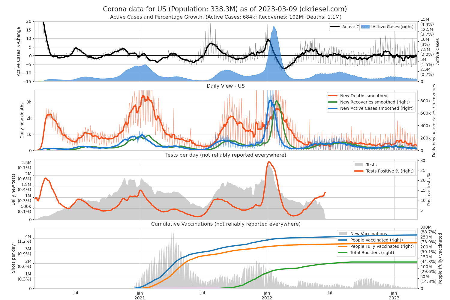
 I Updated my Covid19 plots at http://www.dkriesel.com/en/corona. The cumulative plot has now become an Active Cases plot because that is more interesting from today's perspective. In the daily plot, the Y-axes are now reversed because the Active Cases are more interesting in Omikron than the now much fewer deaths. The vaccination plot now includes booster vaccinations and is normalized to 90% of each country's population size, so you can see at a glance whether a country is doing well or poorly with vaccinations.