Table of Contents
Corona plots and interpretation aids, certified dramatization-free
 Attention: The data sources are partly not updated anymore, so the service is discontinued. It was a pleasure, thank you for all the encouragement!
On this page you will find briefly commented plots of Covid19 case numbers (vulgo: Corona), updated several times a day. Be sure to check the table of contents above for your desired country. The data source is that of Johns Hopkins University. We start with Germany, where I explain the basic elements in the plots and provide interpretation aids. After that, other populous countries are added, sorted by continent (where data looked acceptable, so don't be surprised if some that you expected are missing) and some whose data is interesting. All comments as of March 29, 2020.
I don't provide direct comparison of cases/case growth more than one country within a single plot, because each country will have its own measurement procedures and I think the figures are only partially comparable. So be careful with what you read in the media. As long as the countries themselves do not change the measurement methods significantly during the measurement period, the data can however be used to get an impression of indvidual country's progress, which is what I do. Maybe I will also add a comparison plot with percentual growth of different countries, we'll see.
Here you can download the whole datasets as CSV. For automated downloading more often than once per hour I suggest to email me before, otherwise you might be blocked.
Germany
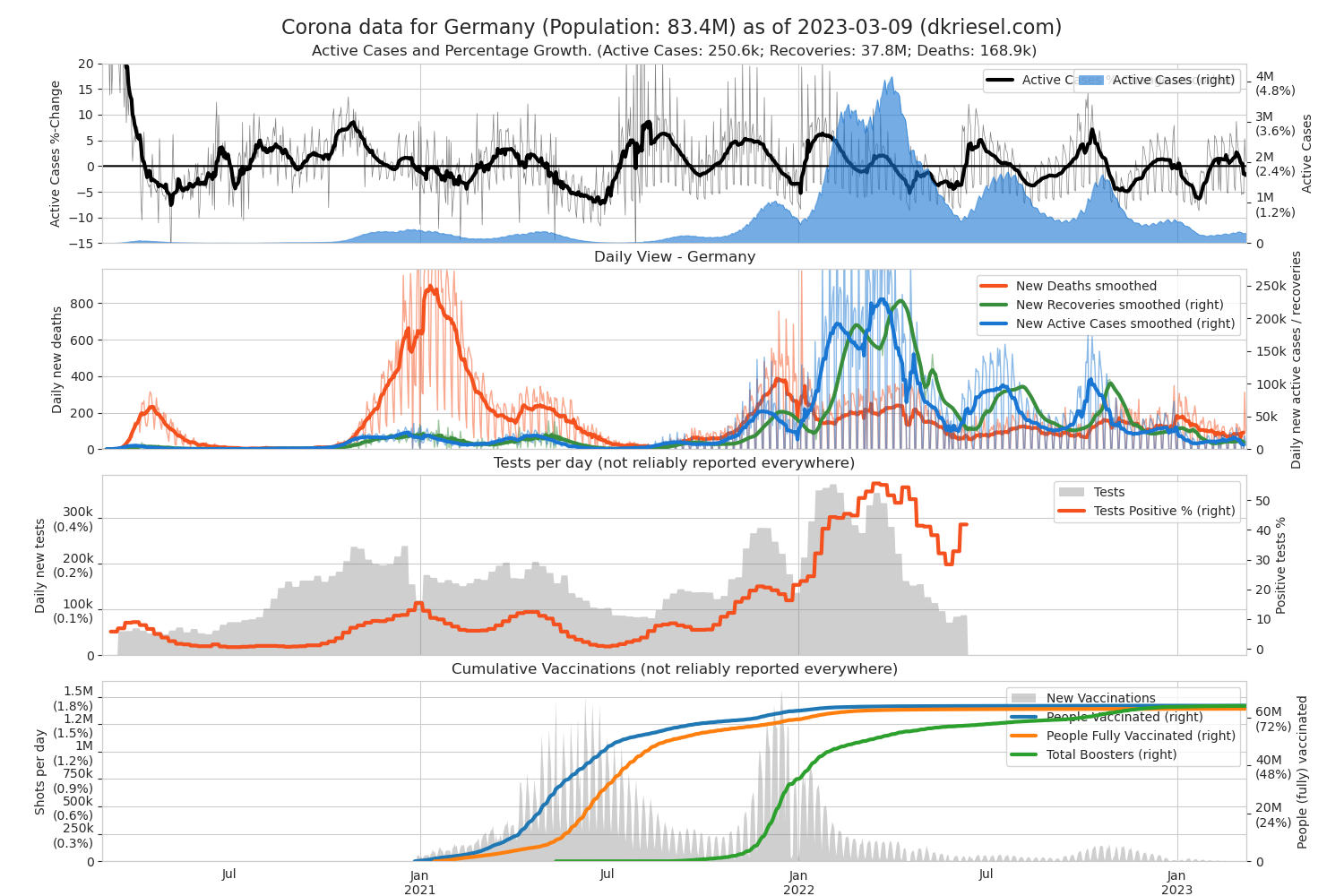
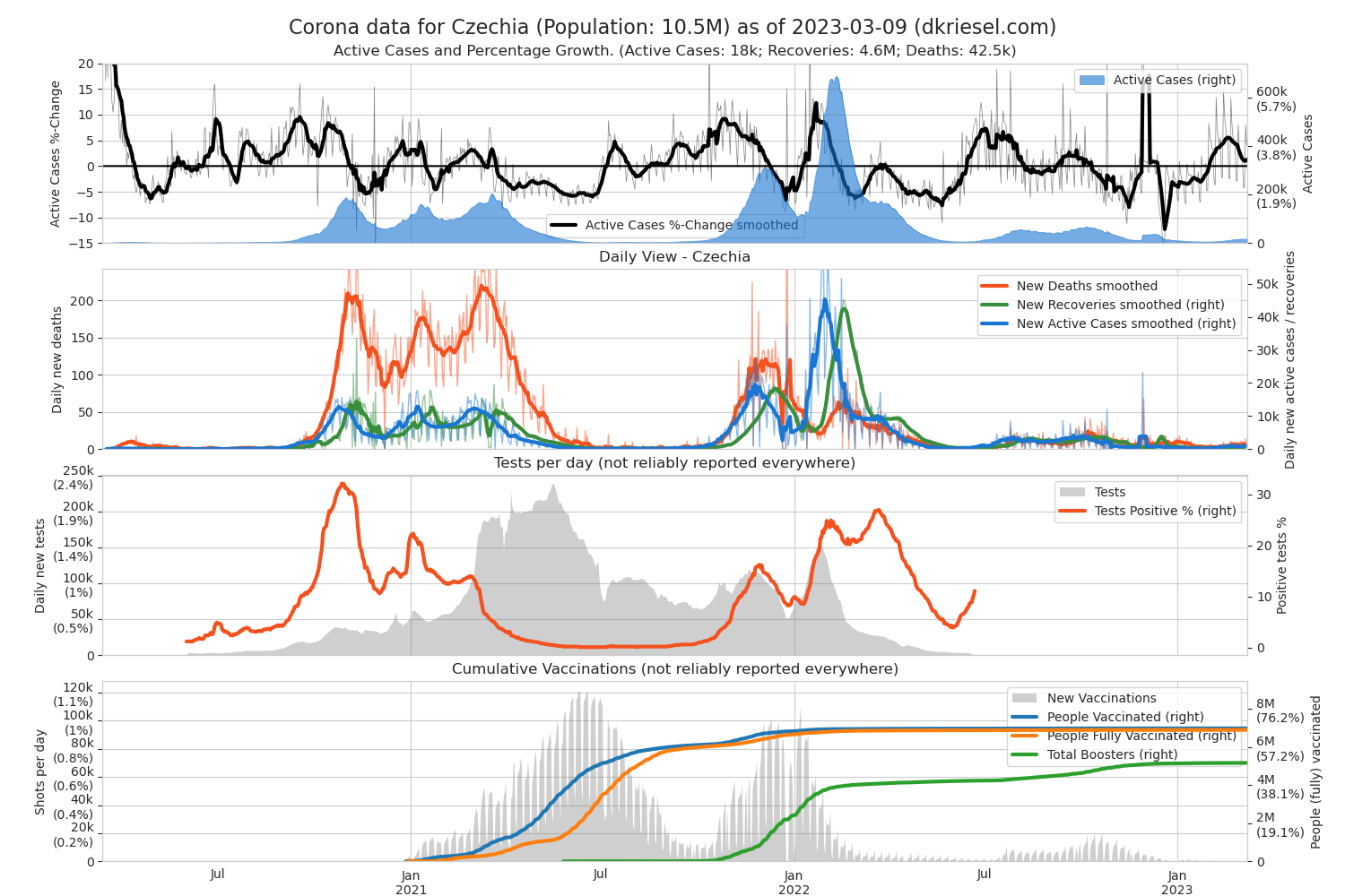
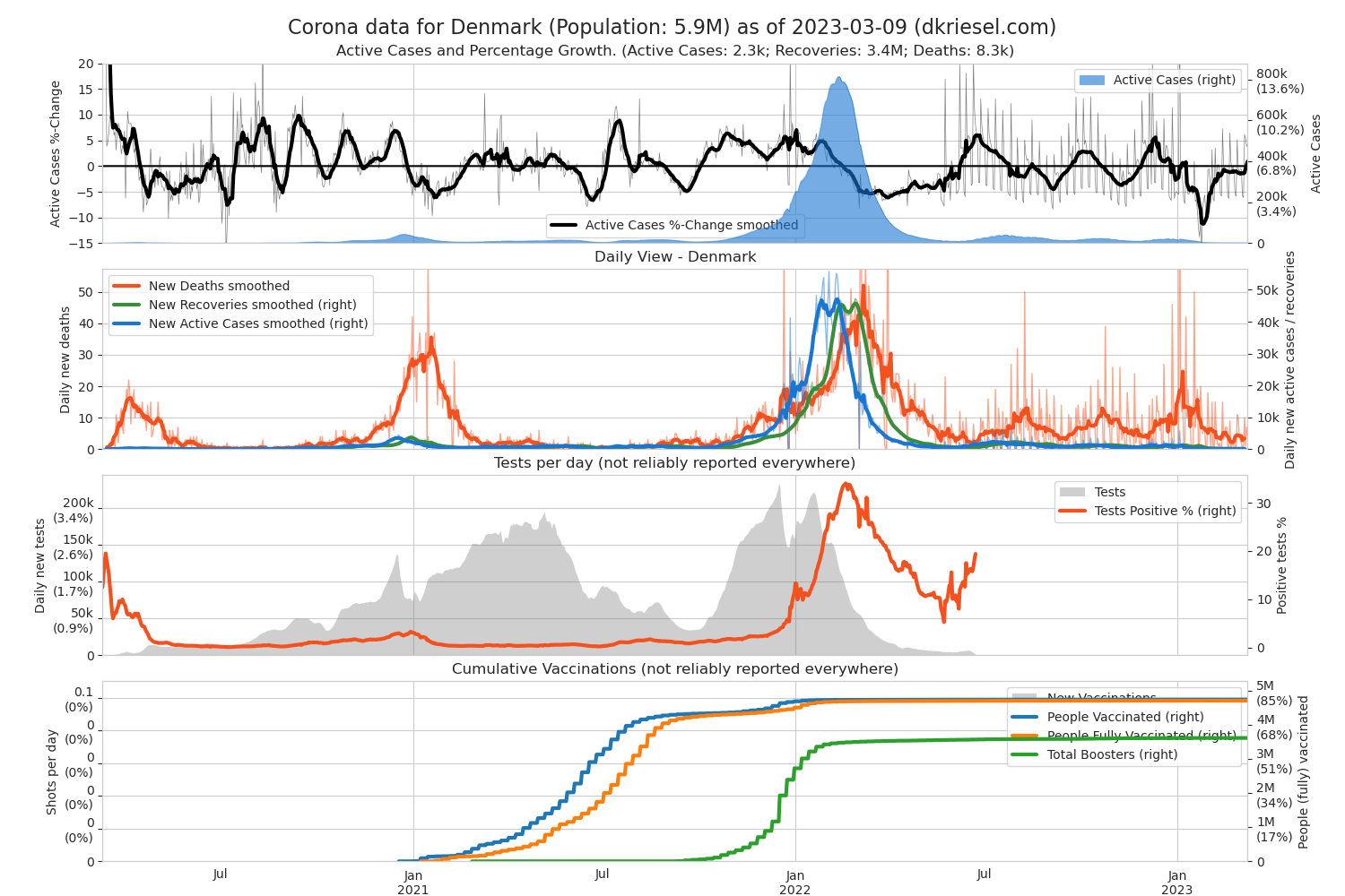
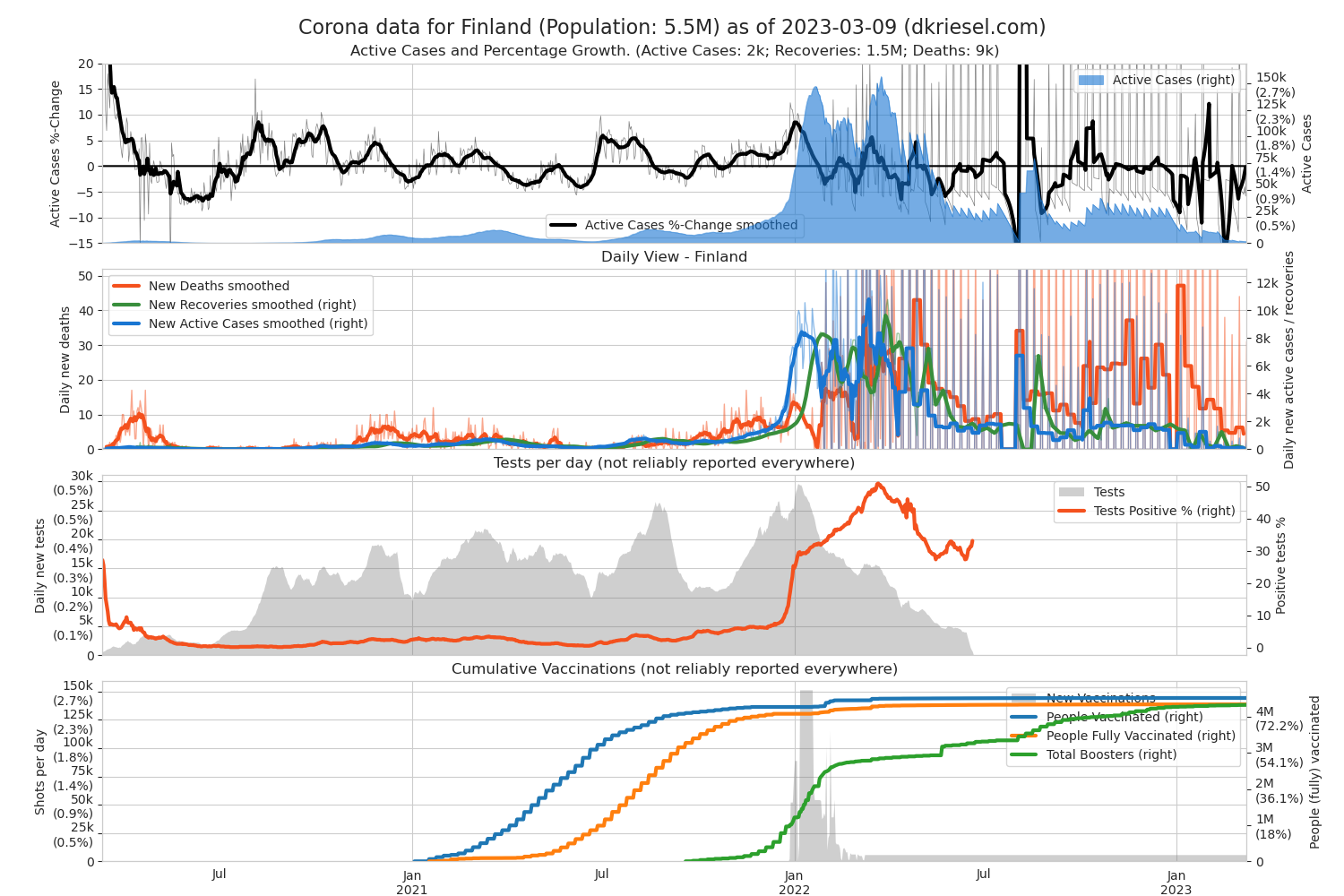
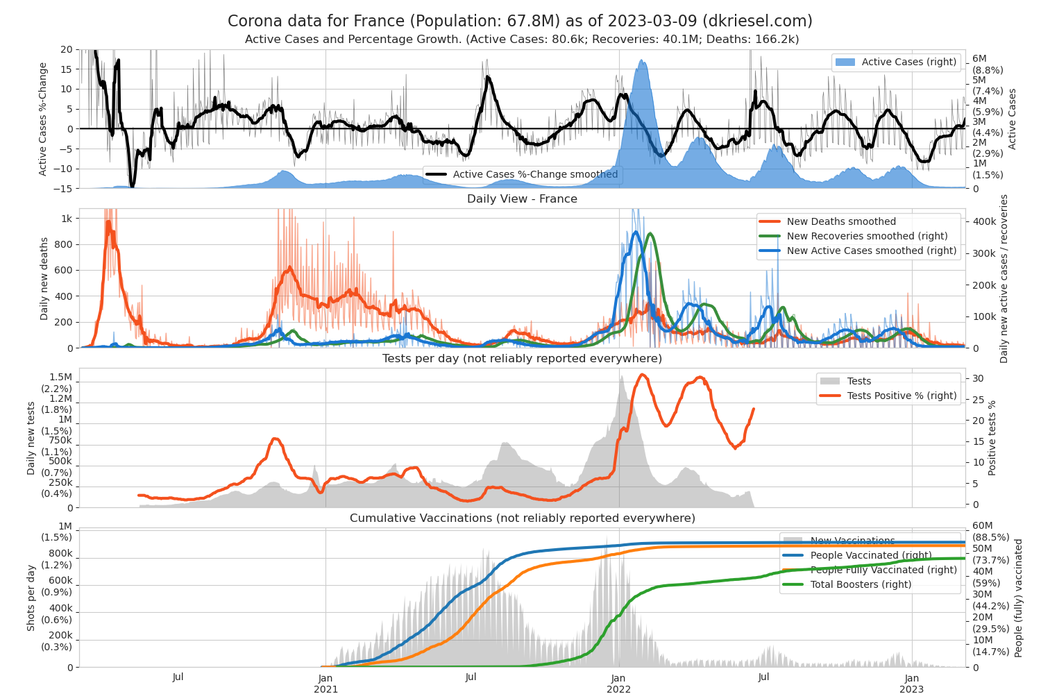
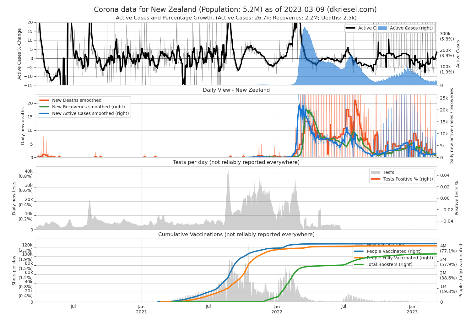
The most important thing is: What is only short term is not true until it becomes more long-term. If you only pay attention to the thick, “smoothed” lines in my plots, you automatically follow this rule. If you see less new infections at the beginning of the week and on weekends, don't give anything on it, because the authorities do have their weekend (no joke!). Watch out for the very regular fluctuations Fluctuations in all data are common! In general, I would only pay attention to longer-term trends in the data. You have been warned.
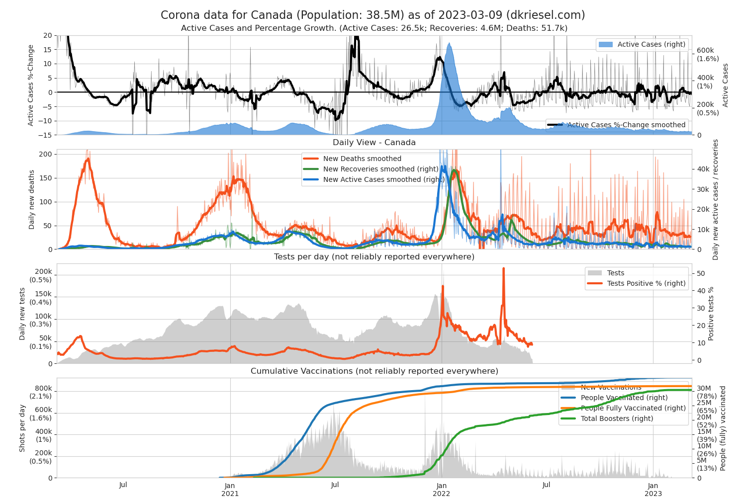
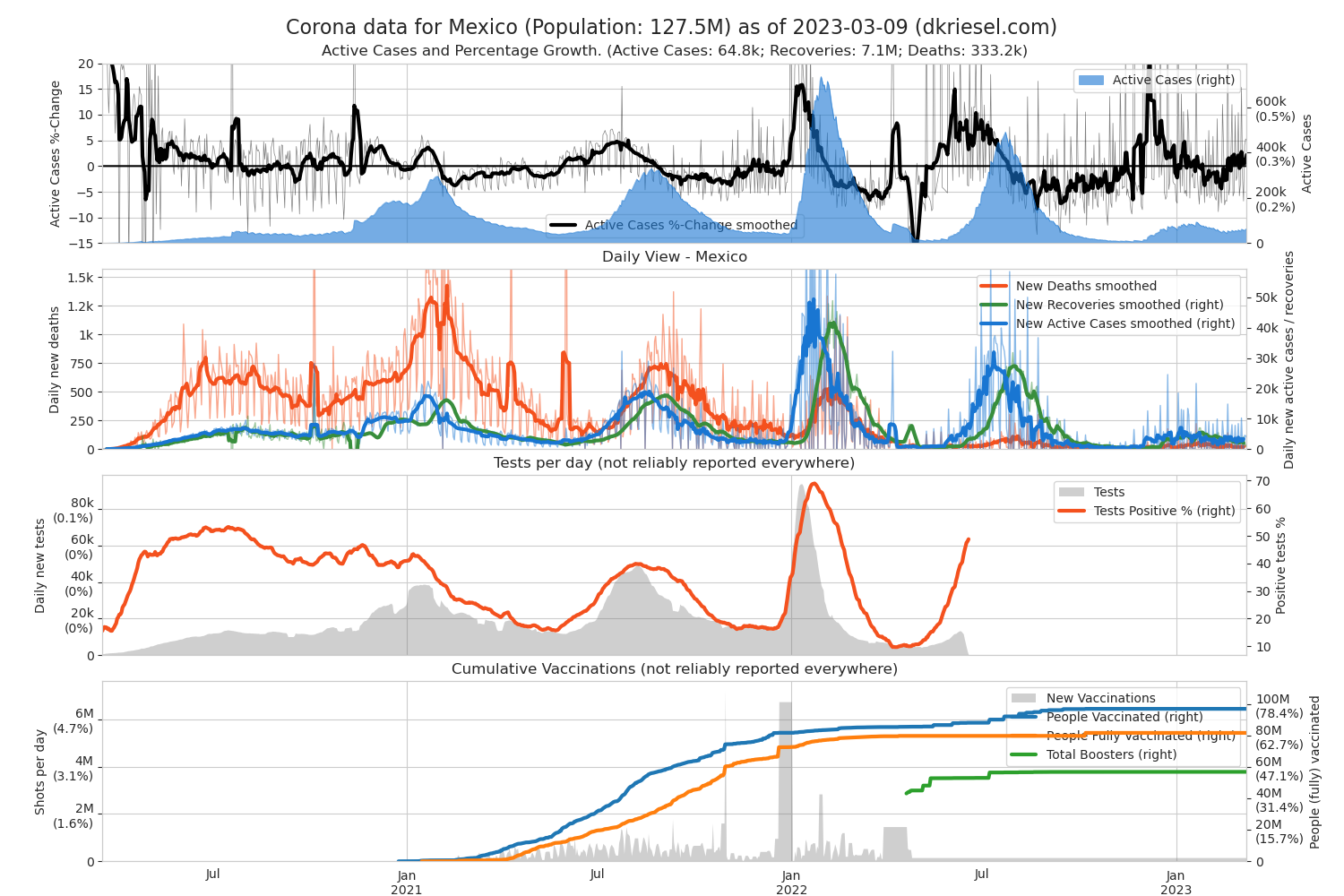
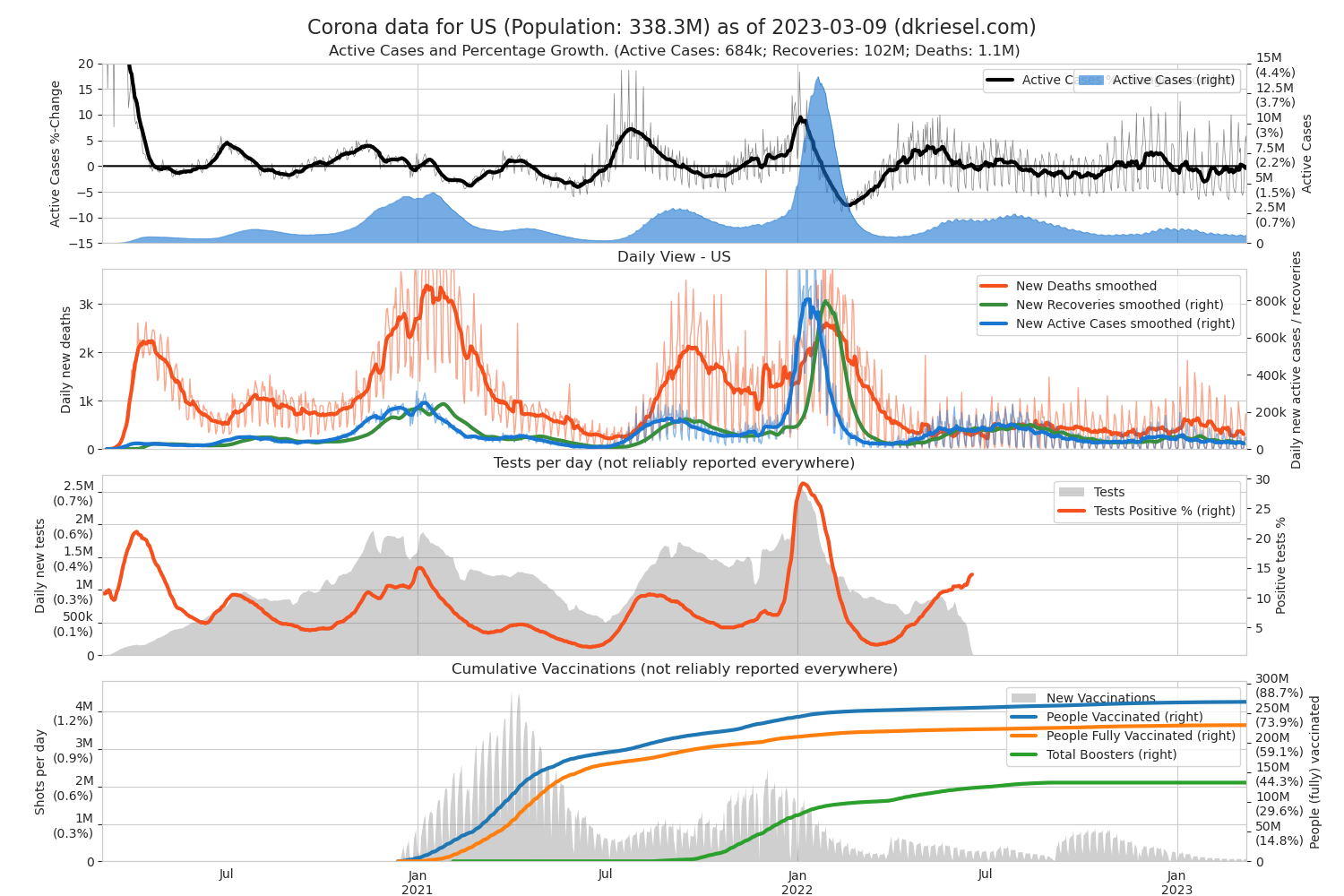
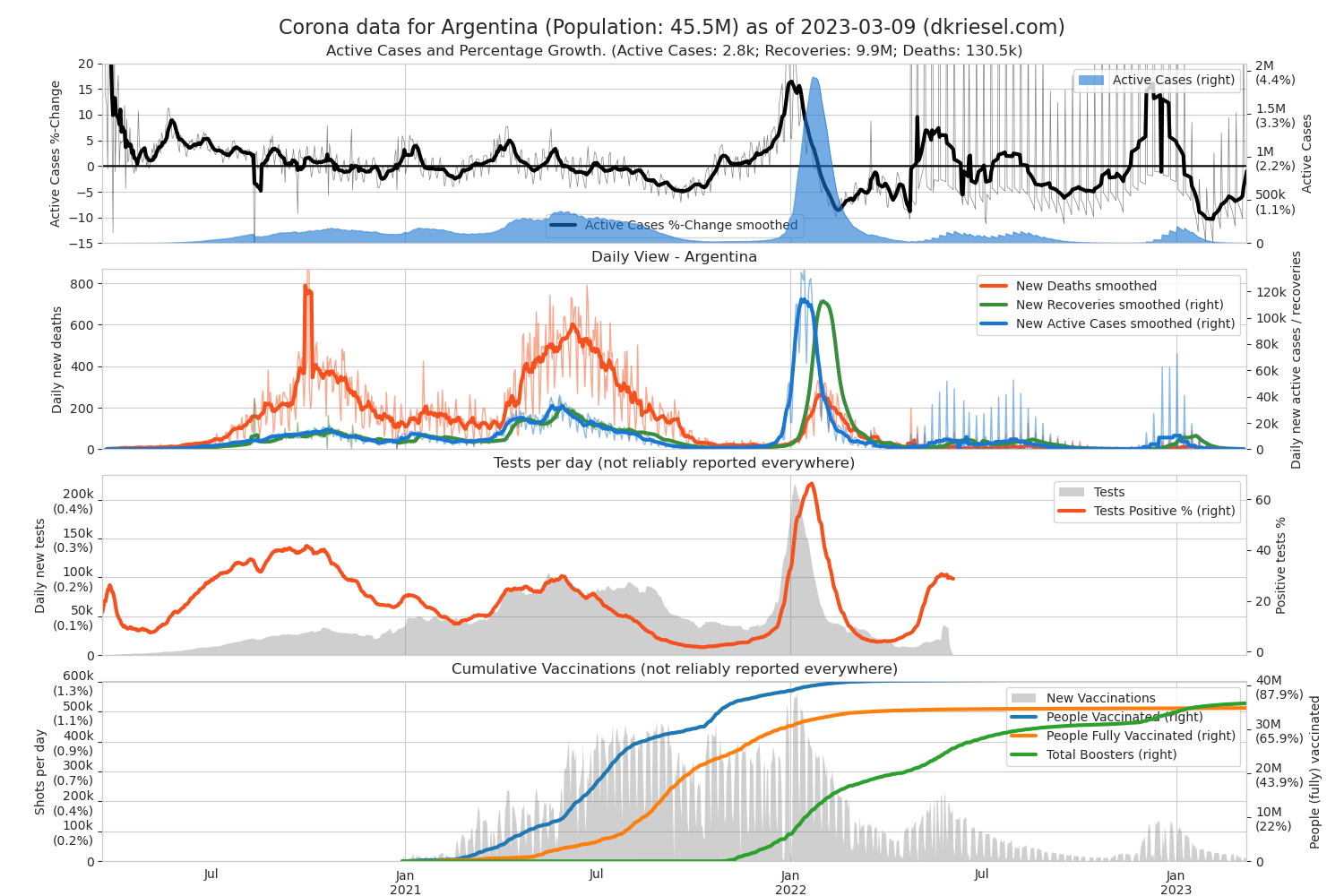
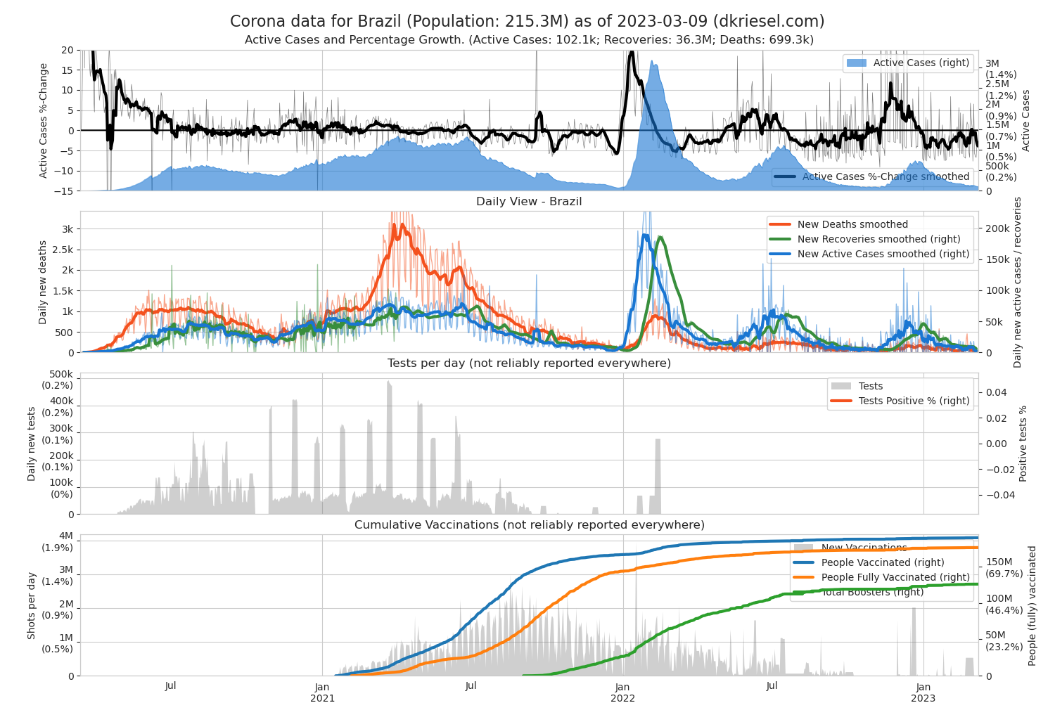
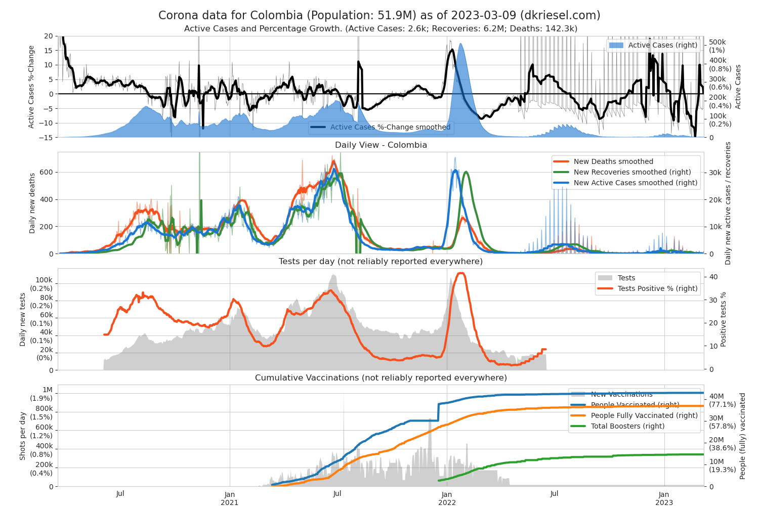
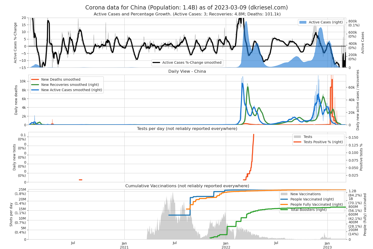
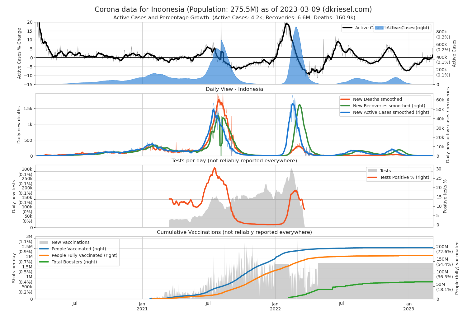
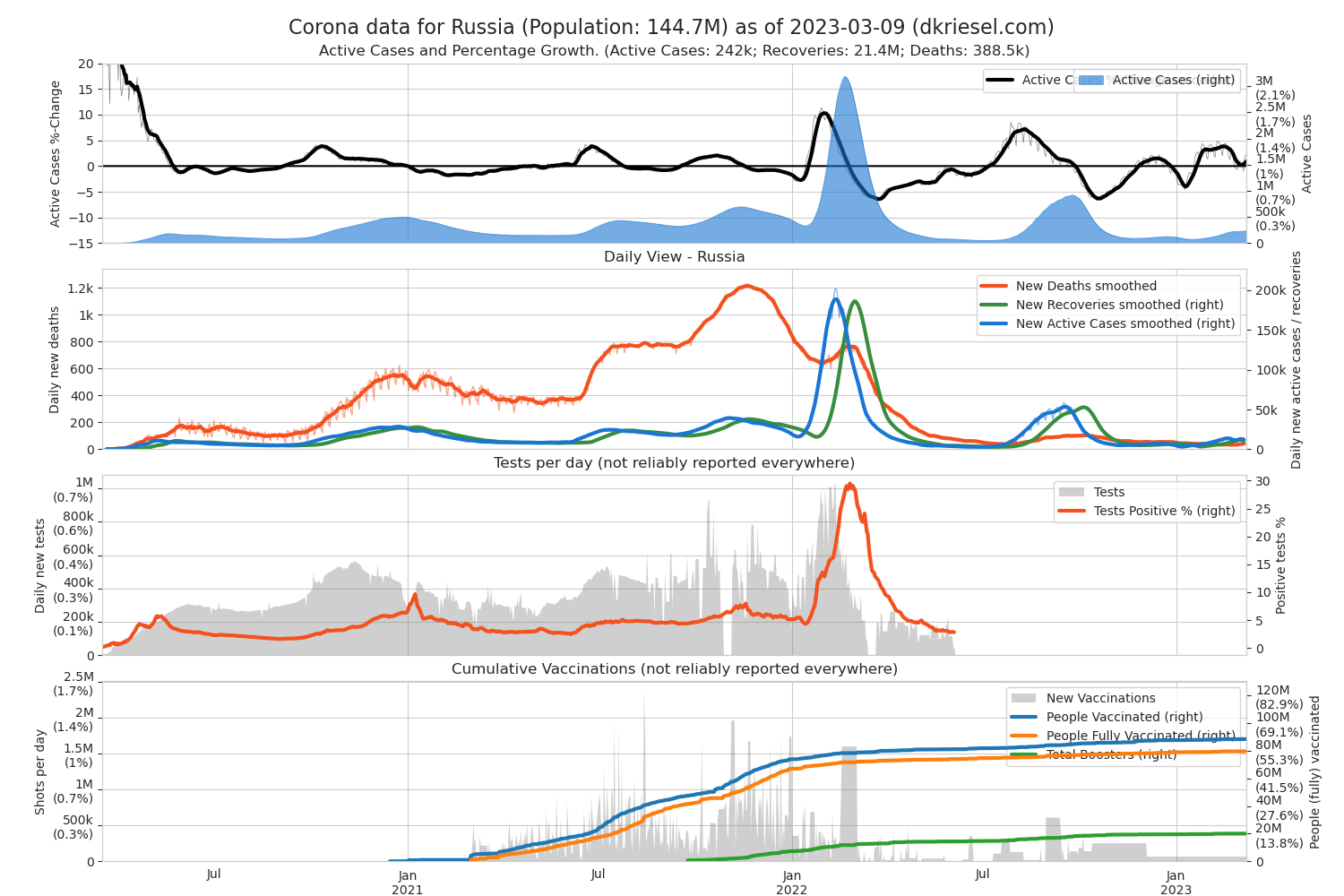
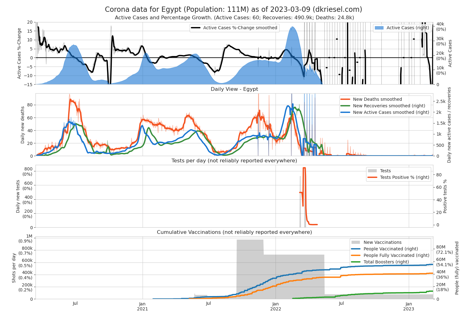
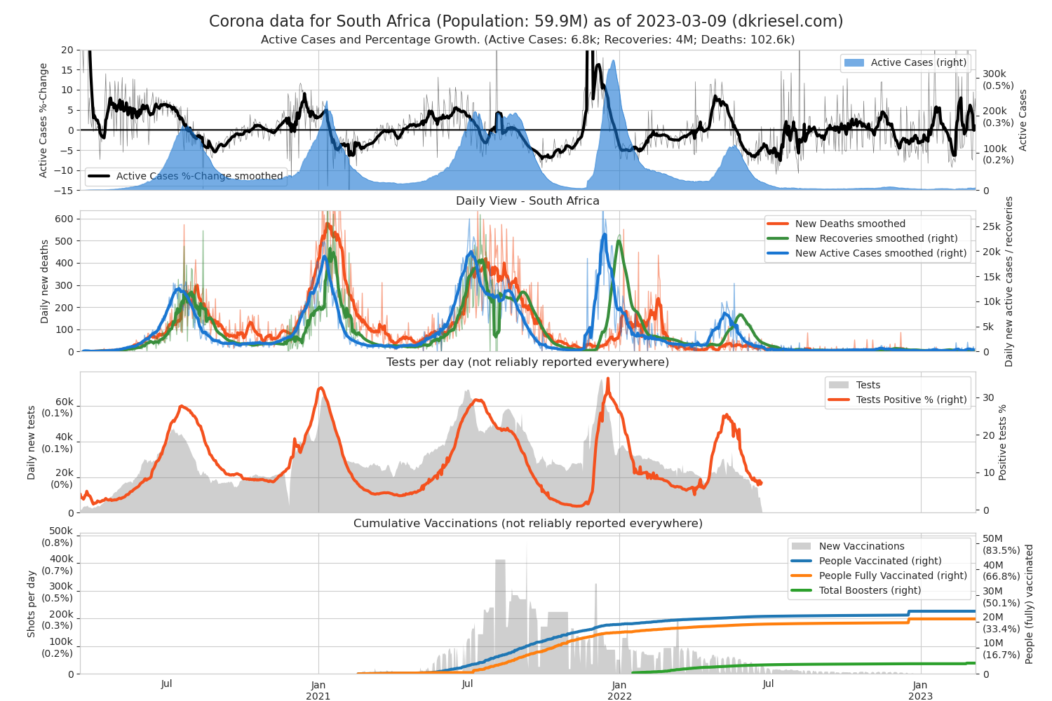
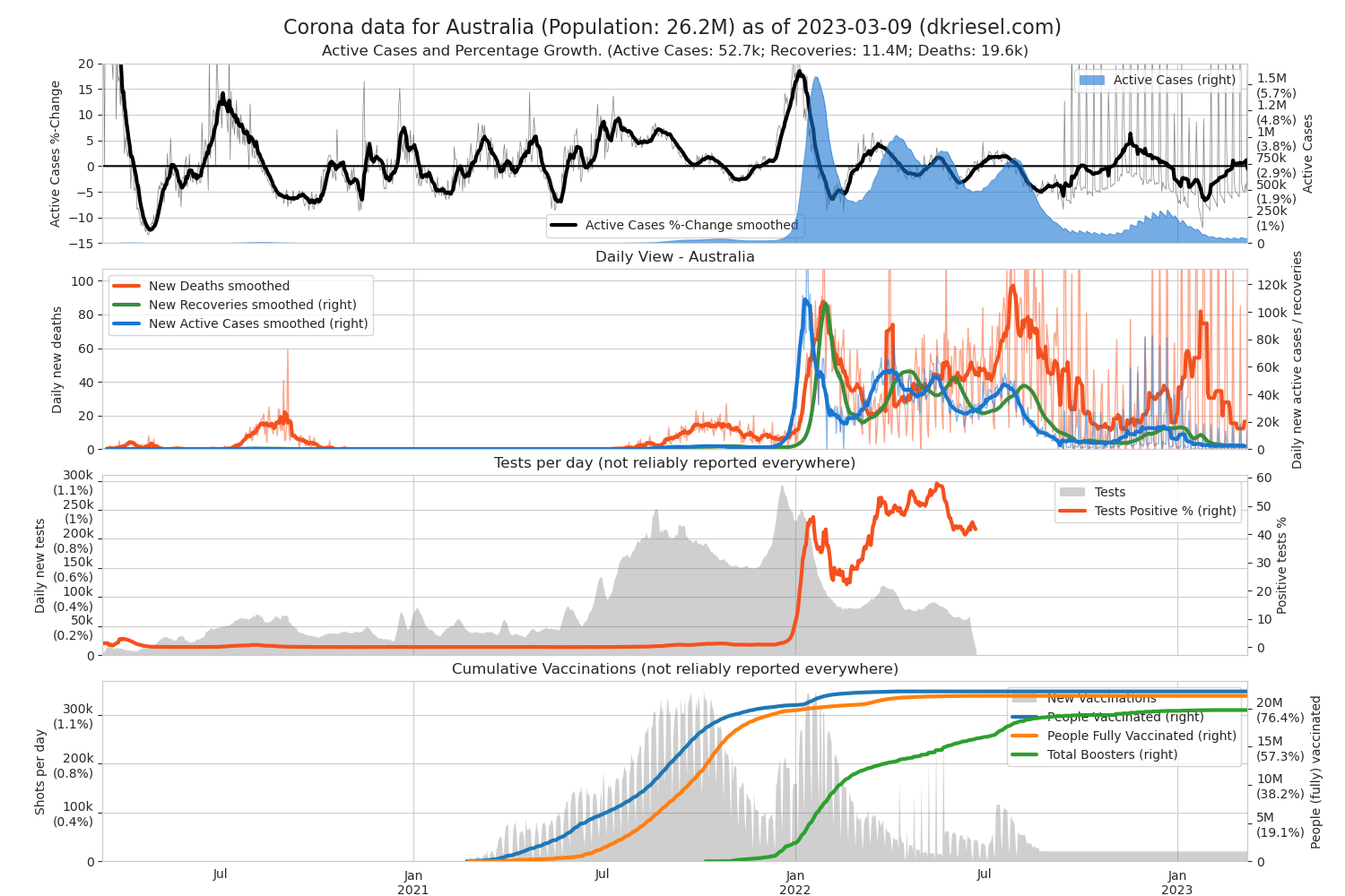
First plot, thick black line: That's what I miss across media, and from my point of view it's the most important thing. This is the percentage growth of active Covid19 cases per day. From this you can see at a glance the growth behavior. The line is somewhat smoothed (for the teccies: all smoothings are rolling averages across 7 days, centered window. For percentages, smoothing means geometric mean of the percentages of the last 7 days), the original is the more transparent jagged line behind it.
- If the spread is not slowed down, the growth rate in most countries fluctuates around 25% per day.
- Stable higher values indicate particularly high infection rates, or that too little testing for Covid19 has been done in advance.
- Stable lower values indicate a slowdown of the infections.
- Negative values are obtained when people recover faster than new people are infected (for example, when the first huge wave of infected people is recovering while there is a curfew).
First plot, colored area: All reported cases (blue). Where countries report it, the cured are green and the deceased red. The total reported cases (including those healed and the dead) are the number always quoted by the media.
- If the virus spreads unchecked, the number of cases grows exponentially until the human population is sufficiently infected.
- If at some point the case number no longer increases, the pandemic in the respective country is contained (see e.g. China). That is the goal. At some point, there will be no more blue areas, but more green ones (healed) with hopefully a small proportion of red ones (deaths).
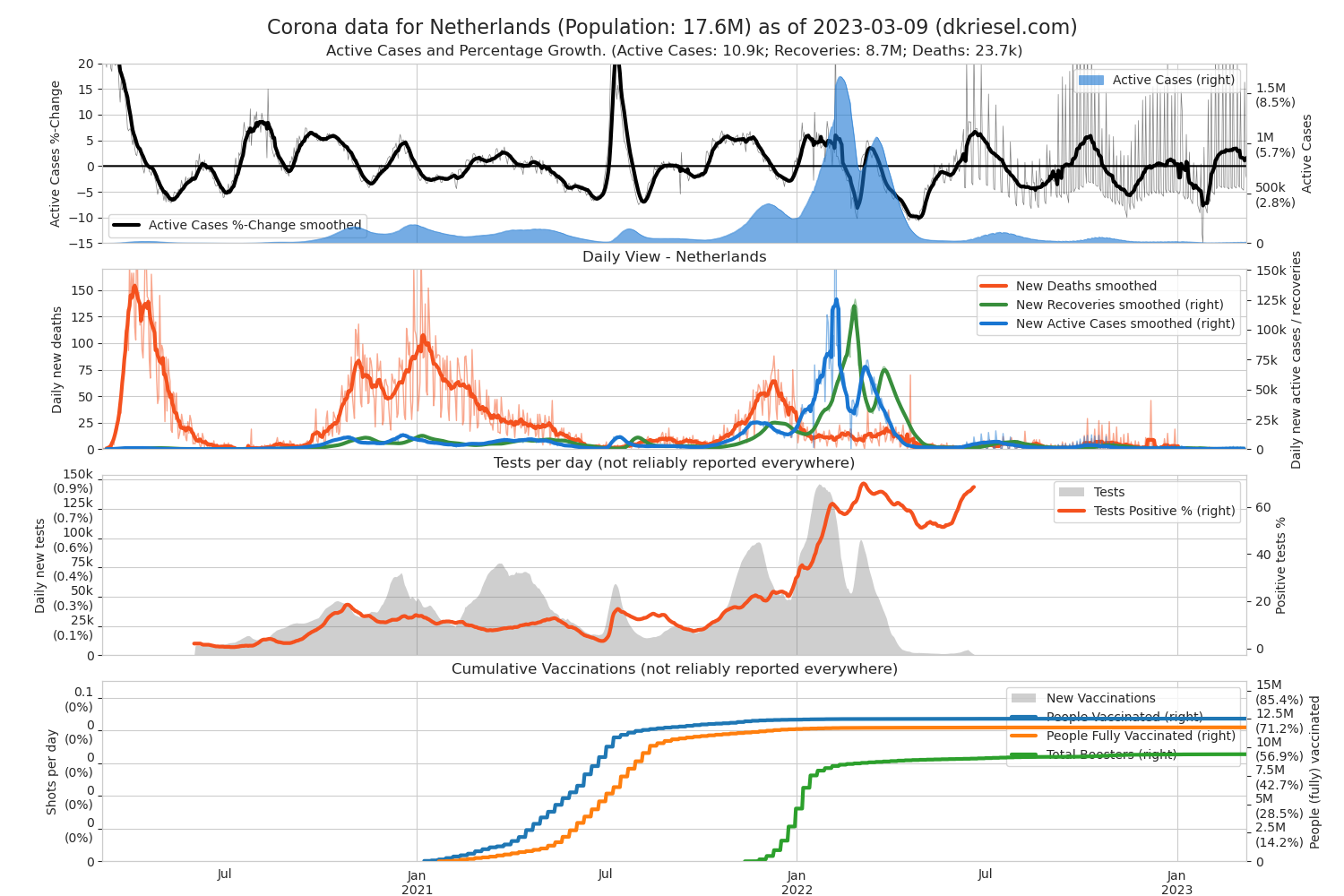
- Important: The recovery numbers are partially corrected by me. I count cases automatically as recovered, if they are not reported recovered or deceased 18 days after their initial active case report at the latest. This corresponds to about 23 days after infection which is a long course and therefore a conservative assumption. This is how I counter the fact that some countries report no or unrealistically few recoveries. This in my opinion reasonable correction has some interesting effects on some countries. Examples (not necessarily exhaustive):
- Netherlands reports almost no recoveries, and has a realistic recovery number now.
- Italy's recovery numbers are corrected upwards at the last few days of their plot.
- China's virus percentual spread rate is corrected upwards towards the end of their plot (it is calculated by new cases vs current active cases, and by my heuristic they have less active cases now as some of them were marked as recovered).
- UK has more deaths than heuristically generated recoveries and therefore even after correction there are still no recoveries.
Second plot: Daily course of the newly reported cases / deaths / healings in analogous colors. Again smoothed variants thick, with originals behind. The goal is to get the new cases to increase less quickly, then decrease, and finally drive it to 0. This is what one should actually use for the prognosis, because every newly reported case is with a certain probability to be hospitalized for some time after reporting, and with less probability it will end up in intensive care after a few more days. The professionals will probably do the same. Nevertheless, I have given more priority to the course of the cumulative cases here, because I wanted to pick you up from what you already know and what is usually quoted.
I think, the other two plots are kind of self-explanatory, but will add further explanations if I get too many emails. 
Europe
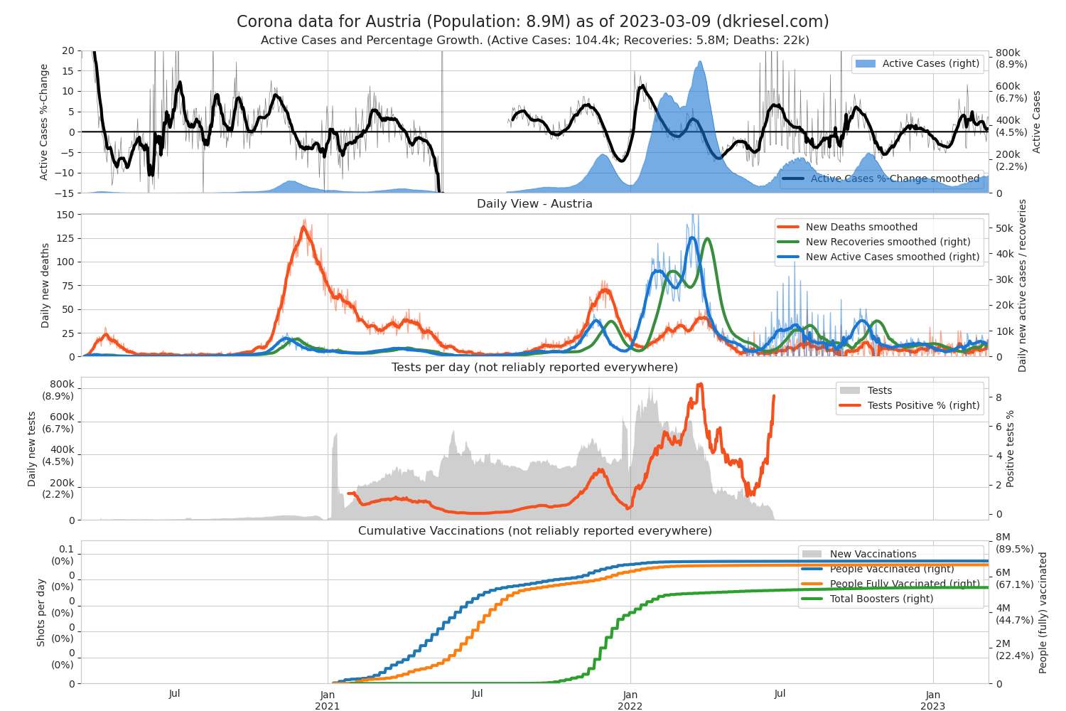
Austria
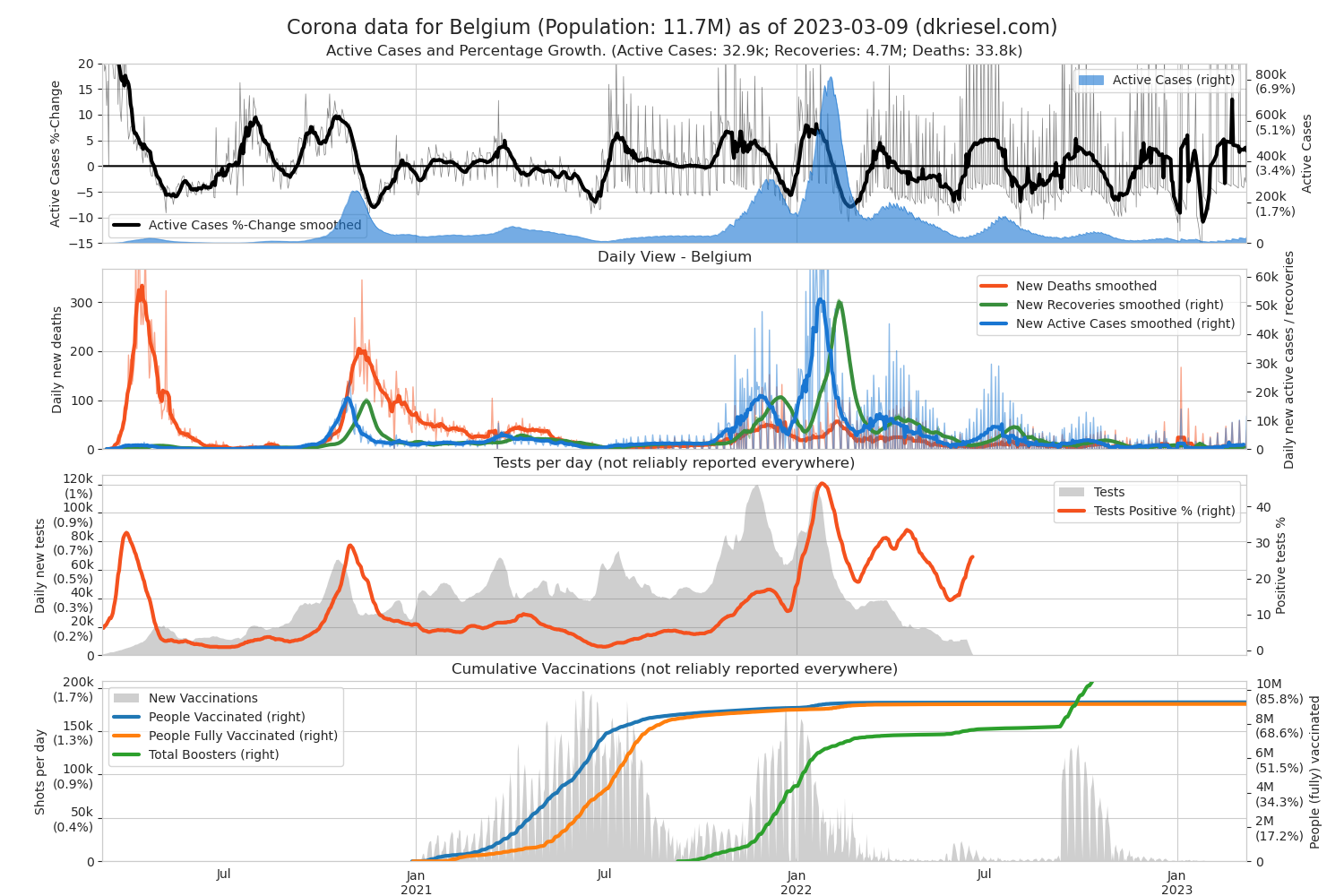
Belgium
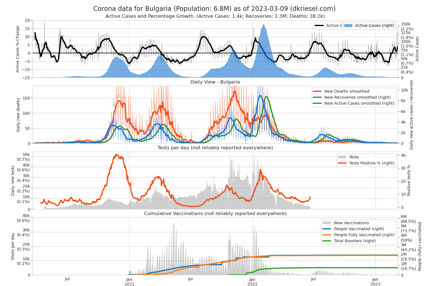
Bulgaria
Czechia
Denmark
Finland
France
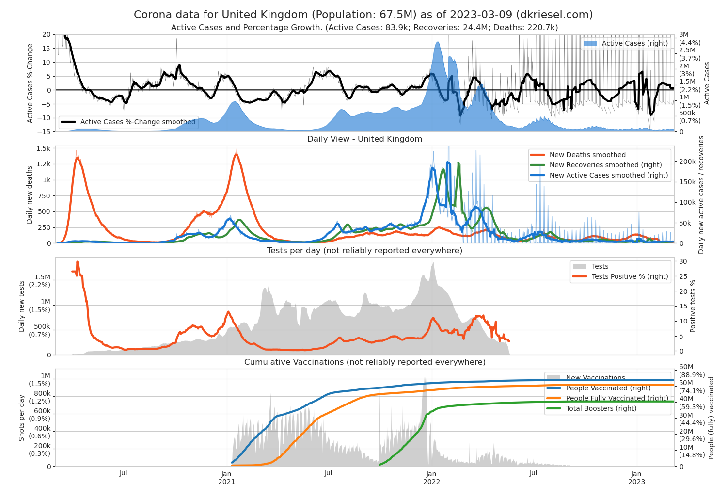
Great Britain
The commitment of the United Kingdom as a statistical control group will not be forgotten. (The UK was comparatively late with anti-infection measures.)
Italy

Netherlands
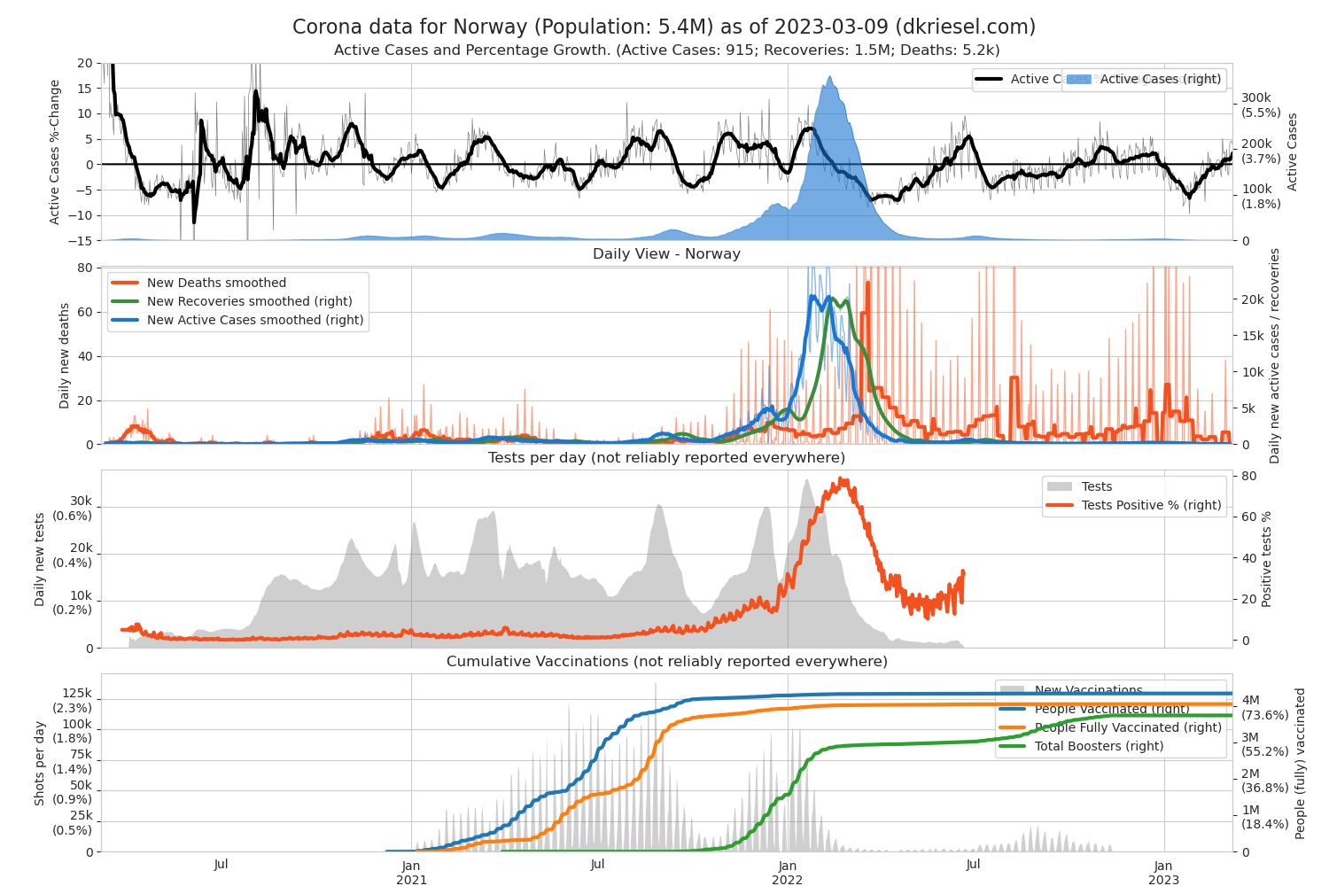
Norway
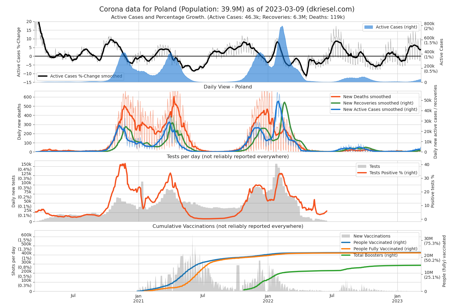
Poland
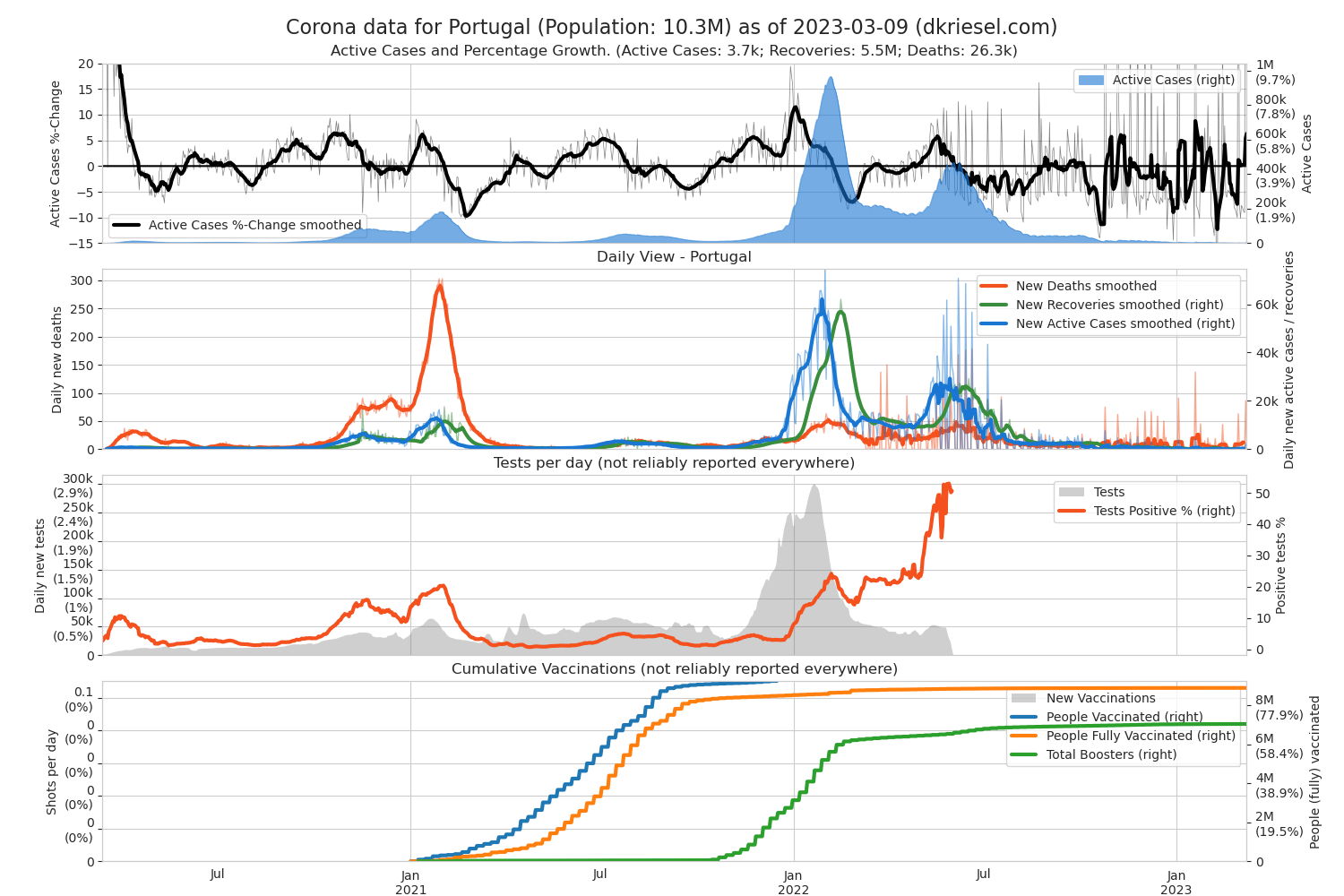
Portugal
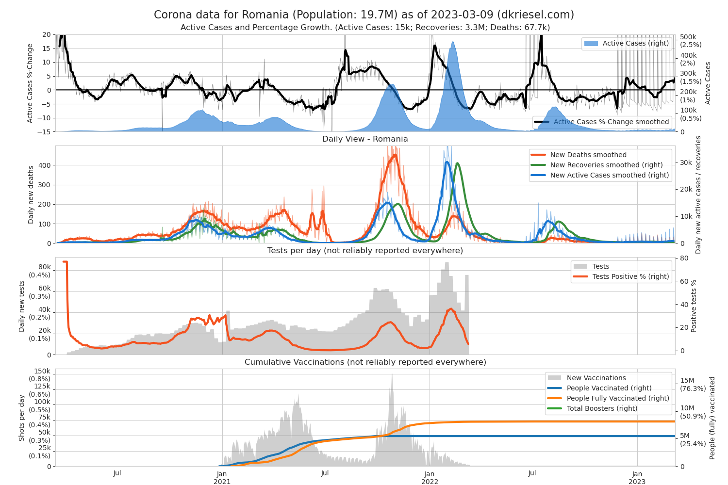
Romania
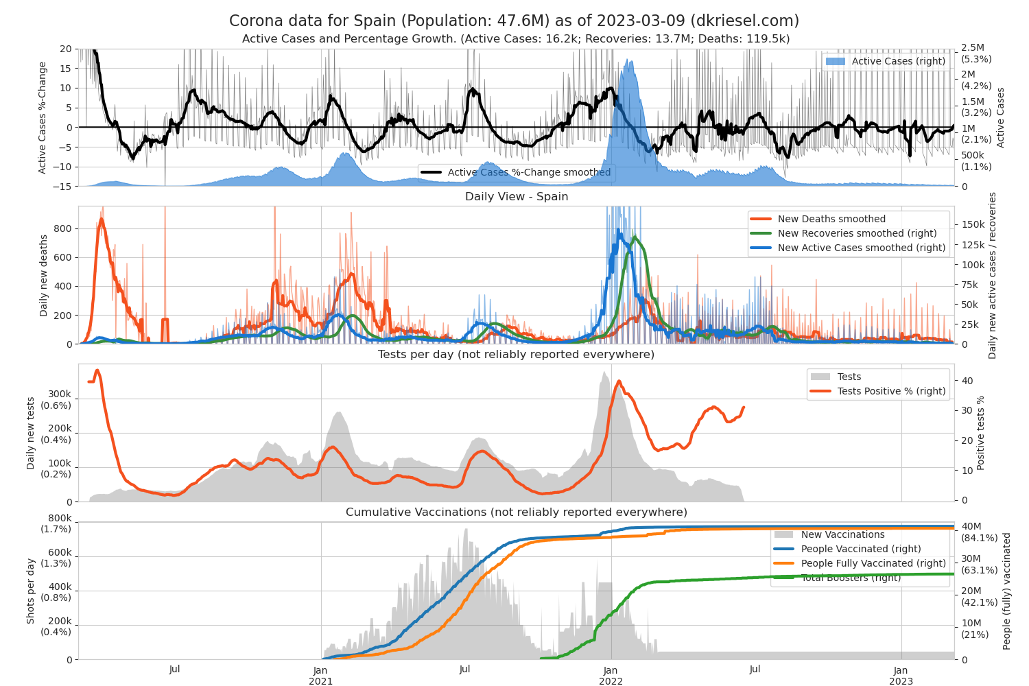
Spain
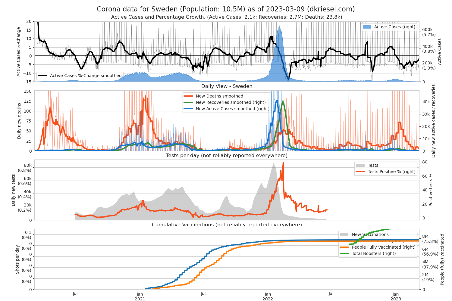
Sweden
Sweden is interesting as control group as they follow a more liberal approach than most other countries.
Switzerland

Middle East
Iran

Israel

North America
Canada
Mexico
USA
South America
Argentina
Brazil
Colombia
Asia
China
India

Indonesia
Japan

Pakistan

Russia
South Korea

Africa
Egypt
South Africa
Oceania
Australia
New Zealand
Updates (major)
- 2020-04-04: Differentiation in active cases / recoveries / deaths added
- 2020-04-07: Percentage growth calculated only on active cases, red orientation line removed. This means that the percentage growth can now also become negative. If it goes below 0, an orientation line is inserted at 0 to emphasize this. Legends cleaned up a bit.
- 2020-04-09: Active cases are automatically counted as recovered 18 days after initial “active case” reporting (about 23 days after infection) unless they are reported as deceased or recovered. Some countries report new cases and deaths very well, but seem to report recoveries not reliably or not at all. Re-adjusted colors in plots.
- 2020-04-10: Daily deaths now have their own y-axis now in the right plot per country. Still have to tweak a bit on the legend though, as the y-helperlines of the new second y-axis in that plot are now printed over the legend. But it's Easter and I'm too lazy right now. Also, we have short notations for axis tick labels now (e.g. 100K instead of 100000).
- 2020-04-17: Active cases in cumulated plot are now at the bottom for better visibility of their decline. Thanks to the lots of people who emailed me and propsed this. Also, smaller layout enhancements.
- 2020-06-04: All smoothing windows increased to 7 days, for percentages applied geometric mean of the last 7 days.
- 2020-07-15: Axis of percentage growth in the left subplots unified across all countries to a range from -15 to +40
- 2021-01-02: New plot for tests and positive rate; new plot for vaccination counts; various axes normalized vs population size; with respect to the pandemics duration, plots on top of each other and larger; “Daily view” second axis scraped, plot now simply scaled logarithmically; Many other small changes.
- 2021-01-04: Due to popular demand in the second plot no more logscale, but return to the original two axes. I didn't know how popular this was. Please stop mailing!
 I'm still evaluating if I'll limit the Y-range to the smoothed values. Edit: Evaluated and found to be good. Will be done from now on.
 - 2022-01-23: The cumulative plot has now become an Active Cases plot because that is more interesting from today's perspective. In the daily plot, the Y-axes are now reversed because the Active Cases are more interesting in Omikron than the now much fewer deaths. The vaccination plot now includes booster vaccinations and is normalized to 90% of each country's population size, so you can see at a glance whether a country is doing well or poorly with vaccinations.